In nature, the Fibonacci sequence describes patterns of efficient growth. For Hayashi, it became a framework for structuring innovation across brand, space, and experience.
Hayashi: A Framework for Growth
Year: 2025
Location: Monterrey, MX.
Status: Completed
Role: Strategic Design Lead — Brand, Space & Experience
Location: Monterrey, MX.
Status: Completed
Role: Strategic Design Lead — Brand, Space & Experience
Hayashi is a technology-driven company defined by constant movement, expanding teams, evolving products, and rapid innovation. As the organization grew, its brand and physical environment no longer reflected the clarity or adaptability of its work.
Rather than addressing isolated touchpoints, the project required a unifying framework capable of supporting growth across visual identity, space, and communication.
The Question
How can Hayashi function not as a fixed set of assets, but as a framework that supports change without losing coherence over time?
The System
The project was conceived as a synthesis across three interconnected planes: Visual, Spatial & Experiential
Rather than treating these as separate deliverables, a single underlying logic was defined to travel across all three. The Fibonacci sequence, found in natural growth systems, offered a proportional structure capable of organizing complexity while allowing flexibility and evolution.
This logic became the backbone of the project: not a visual motif, but a decision-making framework.
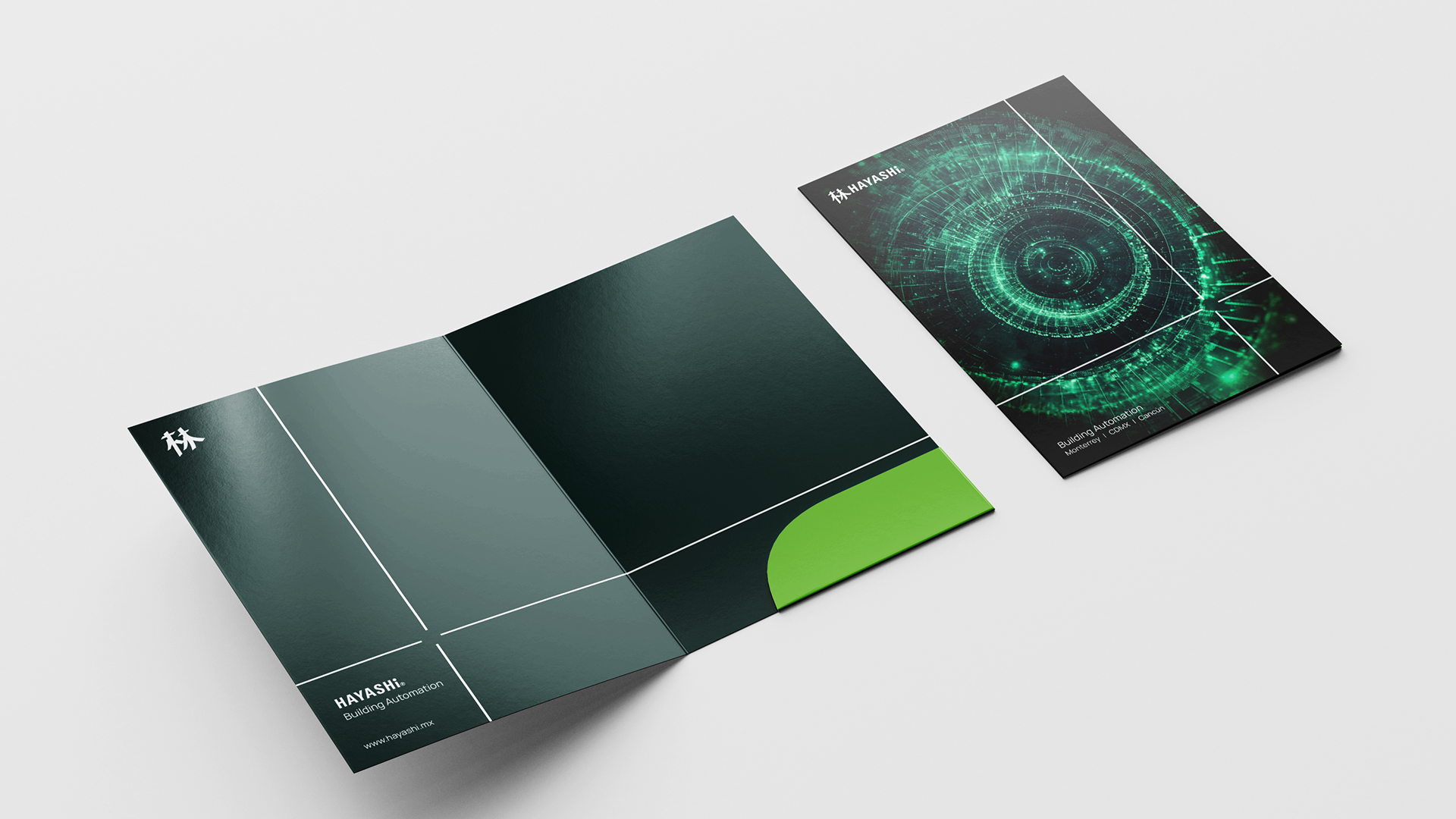
01. Visual System: Identity as Structure
The rebrand began with the construction of a visual language derived from Fibonacci proportions.
Instead of relying on static compositions, the identity was designed as a modular grid system, where proportion — rather than ornament — defines consistency. This approach allows the brand to scale seamlessly, from small digital interfaces to large environmental applications, while maintaining its structural DNA.
The grid itself becomes the identity: adaptable, repeatable, and resilient.
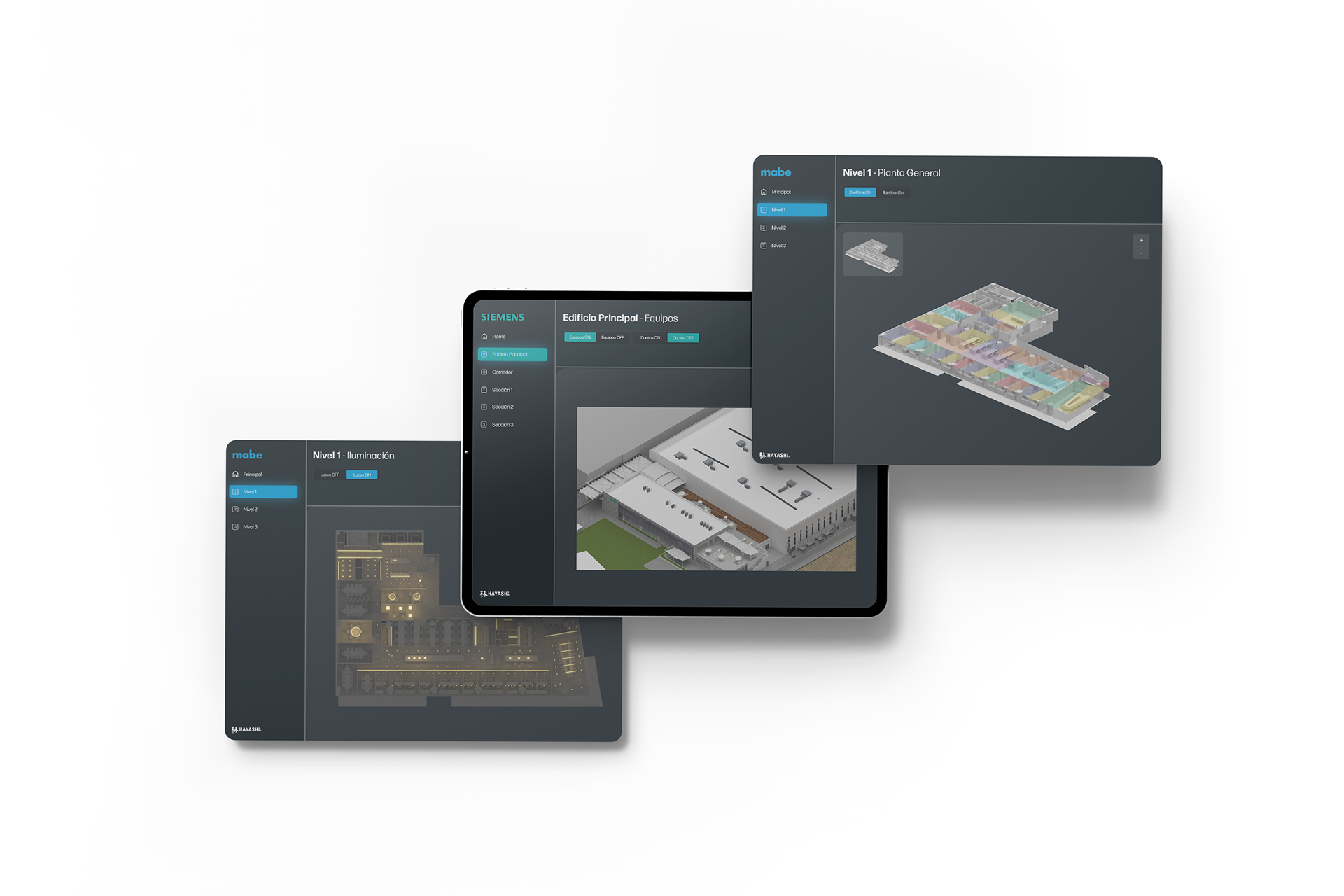
02. Visual Representation System: Standardizing Clarity
A central component of the project was the creation of a standardized visual system for renderings, diagrams, and technical representation.
Hayashi produces complex engineering and automation environments that require clarity to be understood and trusted. Prior to this project, visual outputs varied significantly in tone, scale, and hierarchy, making comparison and evaluation difficult.
I developed a unified representation framework that defines:
Proportional relationships between elements, hierarchies for information density and focus, consistent camera logic, framing, and depth; a restrained color and lighting strategy aligned with the brand
This system allows different teams to produce visuals that feel cohesive — even when created by different people, for different purposes, and at different stages of a project.
The goal was not aesthetic control, but shared legibility: visuals that support understanding, alignment, and faster decision-making.
03. Experiential System: Communication & UI
To complete the framework, the same proportional logic was applied to presentations and digital communication.
A custom UI and slide system was developed for internal and external use. Layouts follow the golden ratio, guiding attention through complex technical information with clarity and rhythm.
As data scales, the interface adapts dynamically, preserving structure and readability regardless of complexity. This ensures continuity between brand identity, visual representation, and communication tools.
The result is not a traditional brand guide, but a shared visual framework, aligning identity, representation, and communication under a single structural logic.
This system reduced friction across teams, improved the consistency of deliverables, and strengthened trust in how Hayashi presents its work.
Most importantly, it allows the organization to grow without losing clarity.